


These are the logos of Q, NME and Kerrang! magazine, I like these logos because they are in very plain fonts but they are all instantly recognisable. I am definitely going to use a very plain font for my magazine logo.
 The use of the ‘NME’ logo in big bold red text gives it a center piece in the page. The gives the reader constant reminders of the company leading the magazine and the resource to research the company on the internet.
 I like how Laura Marling looks very relaxed and not too 'polished' I think that this is a good thing because it makes the artist more relatable and when the audience can relate to a person in a magazine and they know that they are just a normal person it makes them want to read about them. Laura is not styled in very fancy clothes and she looks very cool.
 These are post it notes from an activity that we did in class where we analysed eachothers front covers and made suggestions on how to improve. I really valued this feedback and I decided to keep the photo on the front of my magazine but I changed the spacing of the text and the colour to make it more readable


 |
| My final magazine front cover |
 |
| My final magazine contents page |
 |
| My final magazine double page spread |
 This is my preliminary task college newsletter which I called Edge Bede. I did this around september time, I had no knowledge of making a newsletter and I created it on Microsoft Office Publisher, which is a basic program which is not used to create professional magazines. I made this newsletter without any help from my teacher or any further knowledge of the conventions of magazines.
 As I have already said, when doing my preliminary task, I used a Microsoft Office Publisher to create my cover and contents page, this meant that the quality of my finished task was not as good and professional as my coursework music magazine. This is because for my coursework I used Adobe Photoshop which is a piece of software that professional editors of magazines use. This meant that I could make my magazine look very professional and to a high standard. I did this by editing the photos that I used and even just by positioning things in different places, which is one of the things that I really struggled with when using Publisher as it is very limited as to where you can put things.
 The camera that I used for my photos was not my own camera, I used the models camera as it was much better than my own which is an Olympus VG-120, 14 megapixel with a 5x Wide Optical Zoom. Although this is a fairly good camera, I wanted my photos to be of a better quality so this is the camera that I used to take my photos, it is a Canon EOS 1100D Digital SLR Camera which is 12.2 megapixels.
 As well as using physical equipment to create my magazine, I also used the software on the computers at college in order to both edit the photos and create my magazine. The main program that I used was Adobe Photoshop Elements 5.5 which was the edition which was accessible at college. I used Photoshop for two reasons: to edit the photos for my magazine, and also to create the actual documents. I had not really used Photoshop before and I did not know anything about it so it was a totally new experience using it to create my magazine, but I soon got to grips with it and I feel it has enabled me to create a professional looking magazine.
 This is the cover for Q magazine from August 2010. I picked this cover because although it is very simple (like all Q magazine covers) it made me want to buy this magazine. I had never bought Q magazine before and then when I saw this cover I decided to buy it. I think this is because it is so simple and looks very classy and professional.
 What makes this magazine so simple yet so effective is that it has the layout is always the same. It has the masthead at the top saying “COSMOPOLITAN” in block letters. It usually has a simple colour scheme, for example on this particular months cover the colour scheme is magenta, black, white and green (the green being used on Fearnes clothing.) Cosmo also always has sub headings and sell lines which are always at the side of the main image or even on top of the main image. I like the main image on this magazine because it is very sexy yet subtle; this is the classic chocolate box pose with the lips slightly parted focusing on flawless beauty.
  This is the cover for NME magazine from 10th April 2010. I picked this cover because again it is extremely simple, probably the simplest one I have ever seen from NME. This was a special edition cover; it is one of ten possible covers. You could choose from a number of music artists and an array of colour schemes. I chose Jack White because I like him and he appeals to me. I think the way he is dressed all in black contrasts against the yellow chair he is sitting on and the yellow masthead.
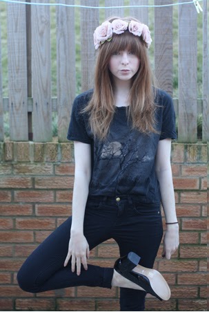
  I have attracted my audience by making my magazine stand out. I have made it stand out because a typical music magazine would use bright colours and it would be very "in your face." This is a good thing because it catches peoples eyes, but the problem with it is that it means that it is no different to all of the other music magazines on the market. I have made my magazine stand out and be individual, I have done this by using soft colours on my magazine front cover and sticking to a maximum of 3 colours. These have been light green, white and grey. I have also made my main image of Bekah Dale to be in black and white. This gives the magazine a vintage look which is a selling point as vintage is very fashionable at the minute.
  I have also used sell lines to tell my audience what will be featured in the magazine. These are familiar and recognisable things such as english festivals such as Leeds and V and The VMA's which is an awards ceremony for artists.
 Speaking as a teenager, I know that when I have money, I want to spend it on things that I need, or that are worth while, and therefore I tend not to buy as many music albums as I used to. On the occasion that I want to buy some new music, I would much prefer to read some reviews about the album, and see what other people either my age or older think about it before I spend my money. I usually rely on NME magazine's 'Reviews' section to inform me of this information, and that's why I thought it would be necessary to include a 'Reviews' section in my magazine. When someone picks up my magazine and flicks to the contents page to see what will be included, they will find that there are a number of reviews which will inform them of which albums are rated highly by professional critics and whether or not to spend their money on them.
 What kind of media institution might distribute your media product and why?
  The overall look of my magazine is different to the looks of the other two music magazines that I have already mentioned. I think that my magazine on terms of aesthetics can be compared to the likes of NYLON which is edited by Marvin Scott Jarrett. I think this because NYLON MAGAZINE IS VERY 'COOL' AND IT IS VERY SIMPLE AND WORKS WITH SOFT AND LIGHT COLOURS ON MOST OF THEIR ISSUES. IT IS ALSO NOT CLUTTERED AND EVERYTHING IS SET OUT VERY WELL.
  Krissi Murison took over as editor of NME magazine in 2009, she was the first female editor of the magazine. She has made the magazine very recognisable since she started, which is one of the things that are very important at NME as it is a very old but well established music magazine. She has also made the magazine more accessible to more people and has made the target audience wider as she has made sure that the magazine covers a lot of different genres of music instead of sticking to one genre but still maintaining NMEs 'cool' reputation.


 I am an AS level student and I am going to use this blog to publish my Media Studies coursework and to publish my progress throughout the year by also uploading homework tasks and giving general updates on how I'm doing.
  The first piece of coursework that will be uploaded onto this blog is my task to create a music magazine. I have taken inspiration from magazines such as Q and NME for my design of my own magazine. I have looked at things such as the layout and colour schemes as well as the content of these magazines to use in my own.