These are the logos of Q, NME and Kerrang! magazine, I like these logos because they are in very plain fonts but they are all instantly recognisable. I am definitely going to use a very plain font for my magazine logo.
 The use of the ‘NME’ logo in big bold red text gives it a center piece in the page. The gives the reader constant reminders of the company leading the magazine and the resource to research the company on the internet.
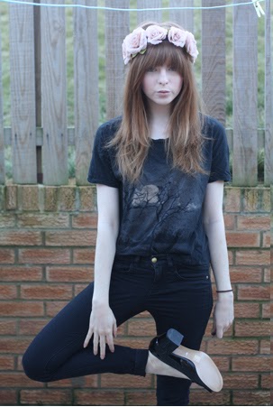
 I like how Laura Marling looks very relaxed and not too 'polished' I think that this is a good thing because it makes the artist more relatable and when the audience can relate to a person in a magazine and they know that they are just a normal person it makes them want to read about them. Laura is not styled in very fancy clothes and she looks very cool.
 These are post it notes from an activity that we did in class where we analysed eachothers front covers and made suggestions on how to improve. I really valued this feedback and I decided to keep the photo on the front of my magazine but I changed the spacing of the text and the colour to make it more readable