 These are post it notes from an activity that we did in class where we analysed eachothers front covers and made suggestions on how to improve. I really valued this feedback and I decided to keep the photo on the front of my magazine but I changed the spacing of the text and the colour to make it more readable
Monday
Feedback from my class
These are post it notes from an activity that we did in class where we analysed eachothers front covers and made suggestions on how to improve. I really valued this feedback and I decided to keep the photo on the front of my magazine but I changed the spacing of the text and the colour to make it more readable
Thursday
MAGAZINE QUESTIONNAIRE
How much money would you pay for a magazine?
What is your favourite genre of music?
ROCK? POP? INDIE? RnB? OTHER? (please name)
What is your favourite part of a magazine?
What sort of features do you dislike in a magazine?
Do you read magazines often?
What features of a magazine do you enjoy reading?
Do you play any instruments?
How many gigs/festivals do you attend each year?
Which way do you prefer to listen to music?
What is your favourite genre of music?
ROCK? POP? INDIE? RnB? OTHER? (please name)
What is your favourite part of a magazine?
What sort of features do you dislike in a magazine?
Do you read magazines often?
What features of a magazine do you enjoy reading?
Do you play any instruments?
How many gigs/festivals do you attend each year?
Which way do you prefer to listen to music?
Double Page spread inspiration

This double page spread is from Q magazine and it is obviously focusing on Lady Gaga. We can tell this because of the medium close up of her on the left hand of the double page spread takes up half of the article which shows that this photo has significance. She is also wearing an outfit and posing in a way which would entice readers which find the female form attractive. The editors of the magazine have ensured that the article has some arousing and sexual content as this sort of stuff sells. The photo has been digitally edited to make it black and white.This means that the whole double page spread focuses around three main colours; black, white and red. These colours anchor the genre of Q magazine.
Lady Gaga herself is presented to the audience as being multi-genred, as she is well known for her pop music yet also being more than able to sway into a more of a rockstar sort of role. This picture reflects this as she has very dark heavy eyes and she is wearing chains around her neck.
The enlarged vibrant red L which is featured behind the text, links not only to Lady Gagas alias but also the colour of it anchors Q magazines style. There is no title to this double page spread, only a full A4 photograph of the artist and her name displayed in the upper right hand corner. This entrigues the reader and draws them in as they must read on further if they're to find out what exclusive information Q has on one of the most famous women of the moment.
 The first inspiration double page spread is from music magazine Kerrang! I like how one of the two pages is a full image of the band as the reader can have a clearer picture of what the band look like. This is something that I would like to do in my double page spread so my audience know what the artist looks like. I also like how the colour scheme is kept, with the colours red, black and white as it looks more professional and neat. The layout of this double page spread is very organised and the text has been structured together so that it is easy for the reader to follow. All together this double page spread is successful and has acheived it's overall purpose and audience.

Monday
3 Original Images
These are my 4 original images that I am going to use in my magazine.


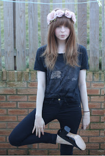


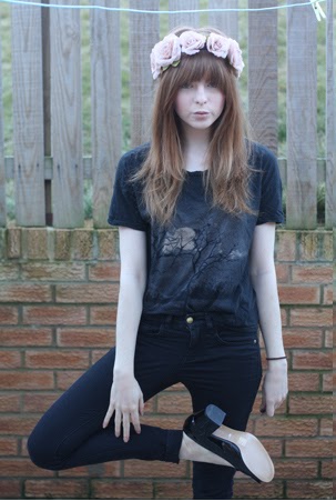
I have decided to use these specific images, because I think they will look very professional when I edit them and make them black and white. I also think that they are good to use because the poses that I told the model to do look like typical model poses in magazines.The clothes that the model is wearing are also good for my music magazine as she looks like she could be a cool indie singer as she is wearing a relaxed tshirt and jeans and a skirt.
Friday
Final Magazine.
 |
| My final magazine front cover |
 |
| My final magazine contents page |
 |
| My final magazine double page spread |
Thursday
Evaluation - Question 7
Looking back at your preliminary task, what do you feel you have learnt in the progression from it to the full product?
 This is my preliminary task college newsletter which I called Edge Bede. I did this around september time, I had no knowledge of making a newsletter and I created it on Microsoft Office Publisher, which is a basic program which is not used to create professional magazines. I made this newsletter without any help from my teacher or any further knowledge of the conventions of magazines.
 As I have already said, when doing my preliminary task, I used a Microsoft Office Publisher to create my cover and contents page, this meant that the quality of my finished task was not as good and professional as my coursework music magazine. This is because for my coursework I used Adobe Photoshop which is a piece of software that professional editors of magazines use. This meant that I could make my magazine look very professional and to a high standard. I did this by editing the photos that I used and even just by positioning things in different places, which is one of the things that I really struggled with when using Publisher as it is very limited as to where you can put things.
I also used effects on the text throughout my magazine which really helped to give it a professional look and feel. I have also learnt how to work with layers on Photoshop making the finish of my coursework to a higher standard as it allowed me to place things on top of one another.
All in all, I think that I have made huge progress from my preliminary task to my final coursework magazine, I have used better a better program to produce and edit my magazine and I have used the feedback I was given from my first task to help me in the production of my music magazine, this has helped me make it into a good final product
Evaluation - Question 6
What have you learned about technologies from the process of constructing this product?
In order to create my music magazine, Flow, I had to learn how to use technologies that I had not used before, and make use of things that I already had. All of these things contributed to my end product of a cover, contents page and double page spread for my magazine which I think had a professional appearance.
 The camera that I used for my photos was not my own camera, I used the models camera as it was much better than my own which is an Olympus VG-120, 14 megapixel with a 5x Wide Optical Zoom. Although this is a fairly good camera, I wanted my photos to be of a better quality so this is the camera that I used to take my photos, it is a Canon EOS 1100D Digital SLR Camera which is 12.2 megapixels.
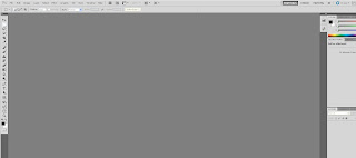 As well as using physical equipment to create my magazine, I also used the software on the computers at college in order to both edit the photos and create my magazine. The main program that I used was Adobe Photoshop Elements 5.5 which was the edition which was accessible at college. I used Photoshop for two reasons: to edit the photos for my magazine, and also to create the actual documents. I had not really used Photoshop before and I did not know anything about it so it was a totally new experience using it to create my magazine, but I soon got to grips with it and I feel it has enabled me to create a professional looking magazine.
In order to create my music magazine, Flow, I had to learn how to use technologies that I had not used before, and make use of things that I already had. All of these things contributed to my end product of a cover, contents page and double page spread for my magazine which I think had a professional appearance.
CAMERA - photography
 The camera that I used for my photos was not my own camera, I used the models camera as it was much better than my own which is an Olympus VG-120, 14 megapixel with a 5x Wide Optical Zoom. Although this is a fairly good camera, I wanted my photos to be of a better quality so this is the camera that I used to take my photos, it is a Canon EOS 1100D Digital SLR Camera which is 12.2 megapixels.
PHOTOSHOP - editing and making
 As well as using physical equipment to create my magazine, I also used the software on the computers at college in order to both edit the photos and create my magazine. The main program that I used was Adobe Photoshop Elements 5.5 which was the edition which was accessible at college. I used Photoshop for two reasons: to edit the photos for my magazine, and also to create the actual documents. I had not really used Photoshop before and I did not know anything about it so it was a totally new experience using it to create my magazine, but I soon got to grips with it and I feel it has enabled me to create a professional looking magazine.
Subscribe to:
Posts (Atom)